
Published - 8 months ago | 10 min read
B2B UX Design That Actually Works: A Field Guide for Product Leaders
Enterprise software carries a heavy load. It must respect governance, integrate with old and new systems, support long buying cycles, and serve people with very different goals. When the experience falters, sales slow down, onboarding drags on, support tickets climb, and renewal conversations become tense. When the experience lands, adoption climbs, training time shrinks, and customer success teams get to spend time on outcomes rather than hand-holding.
This guide distills a practical approach to B2B UX that holds up in real programs. It avoids flash for the sake of flash and focuses on steady, measurable impact. The language is plain on purpose so a designer, a PM, or a CFO can read the same page and come away aligned.
This guide distills a practical approach to B2B UX that holds up in real programs. It avoids flash for the sake of flash and focuses on steady, measurable impact. The language is plain on purpose so a designer, a PM, or a CFO can read the same page and come away aligned.
What makes B2B UX different from B2C
1. Many buyers, many users, one product
A consumer app answers to one person at a time. A B2B platform answers to a buyer group, a security team, finance, an admin, and several user roles. Each of these groups evaluates value in a different way. Decision makers watch the total cost of ownership, risk, and integration fit. End users care about speed, clarity, and fewer clicks. Admins need control, audit trails, and a stable configuration.
Good B2B UX treats the product as a shared asset. That means clear separation of concerns in the interface. It also means a plan for demos, trials, and proof-of-concept flows that help teams evaluate as a group.
Good B2B UX treats the product as a shared asset. That means clear separation of concerns in the interface. It also means a plan for demos, trials, and proof-of-concept flows that help teams evaluate as a group.
2. Long cycles and handoffs
Enterprise deals stretch across months. Information moves through pre-sales, solution architecture, procurement, security review, and legal. Interfaces need to support this journey with shareable artifacts, exportable data, stable URLs, and permissioning that mirrors real committees. Change logs and version history are not extras. They are part of how teams justify decisions.
3. Workflows that cross systems
A marketing ops manager does not only use your product. They pivot between CRM, automation, analytics, and BI. A transportation planner jumps between order capture, routing, carrier portals, and finance. B2B UX anticipates context switching. It surfaces the right next step, preserves state when a user returns, and fits neatly into existing tools through APIs, webhooks, and embedded widgets.
Core principles for effective B2B UX
Principle 1: Outcome clarity
Every primary screen should answer a simple question. What should the user accomplish here, and how will they know they did it. That means a visible status, progress indicators, and concise success criteria. Remove doubt about the next action. Provide safe exits. Let the user preview impact before committing a change.
Checklist
- Clear page purpose statement
- Primary action is visible and enabled only when prerequisites are met
- Contextual success and failure messages with remediation steps
- Undo where feasible, or safe sandbox modes
Checklist
- Clear page purpose statement
- Primary action is visible and enabled only when prerequisites are met
- Contextual success and failure messages with remediation steps
- Undo where feasible, or safe sandbox modes
Principle 2: Role awareness
A sales rep, a regional controller, and a tenant admin need different information and controls. Build role models early, then enforce them in navigation, layout, and terminology. Keep the shared core consistent so cross-role training does not multiply.
Checklist
- Role-based navigation and dashboards
- Field-level and action-level permissions
- Terminology glossary per role in product help
- Stable URLs so admins can deep-link training
Checklist
- Role-based navigation and dashboards
- Field-level and action-level permissions
- Terminology glossary per role in product help
- Stable URLs so admins can deep-link training
Principle 3: Scalability in both data and org size
B2B datasets grow quickly. Tables that feel fine with hundreds of rows become painful with millions. The same product must serve a 20-person startup and a multinational division.
Checklist
- Server-side search, filters, and pagination
- Saved views that persist by user, role, or team
- Bulk actions with guardrails
- Performance budgets and target response times captured as product requirements
Checklist
- Server-side search, filters, and pagination
- Saved views that persist by user, role, or team
- Bulk actions with guardrails
- Performance budgets and target response times captured as product requirements
Principle 4: Explainability
People make business decisions in your interface. They need to trust what they see. If you surface a score, show the factors. If you recommend a next step, show the inputs. If you flag risk, provide the evidence and a way to audit.
Checklist
- Inline rationale for scores, alerts, and recommendations
- Hover or expand for model inputs and last refresh time
- Audit trails with who, what, when, and previous state
- Exportable reports for compliance and executive review
Checklist
- Inline rationale for scores, alerts, and recommendations
- Hover or expand for model inputs and last refresh time
- Audit trails with who, what, when, and previous state
- Exportable reports for compliance and executive review
Principle 5: Interoperability first
A great B2B product behaves like a good neighbor. It integrates cleanly, fails gracefully when an upstream system is slow, and provides predictable contracts.
Checklist
- Documented APIs with versioning and deprecation policy
- Webhook retries with backoff and signing
- Connectors for common platforms with clear setup wizards
- Event logs for integration failures with actionable messages
Checklist
- Documented APIs with versioning and deprecation policy
- Webhook retries with backoff and signing
- Connectors for common platforms with clear setup wizards
- Event logs for integration failures with actionable messages
Principle 6: Guardrails over gates
Preventing mistakes is cheaper than fixing them. Use constraints, previews, simulated runs, and warnings that reference the user’s actual data. Reserve hard blocks for true policy violations.
Checklist
- Validation at form field and server level
- “Dry run” for bulk updates and destructive tasks
- Clear descriptions of side effects before execution
- Fine-grained permissions instead of blanket restrictions where possible
Checklist
- Validation at form field and server level
- “Dry run” for bulk updates and destructive tasks
- Clear descriptions of side effects before execution
- Fine-grained permissions instead of blanket restrictions where possible
Information architecture that reduces cognitive load
Model the domain, then model the UI
Start with the nouns and verbs of the business. In a logistics platform, shipments, legs, carriers, and documents carry most of the weight. In a finance platform, entities, ledgers, periods, and policies do. Map relationships and lifecycle states first. Only then design screens and URLs.
Navigation that mirrors real work
Primary navigation should align with the top tasks for each role. Secondary navigation handles configuration, historical data, and one-off utilities. Favor stable, shallow structures over clever nesting. Users should never wonder if a record lives under “Operations” or “Transactions.” The answer must be obvious from the language.
Search and filters as first-class features
B2B users often arrive with a clear intent. They know the order number, the account, or the date range. Provide a prominent search box on every page. Offer rich filters with sensible defaults. Persist the last used view. Let users save and share filter presets.
Search essentials
- Instant results with typeahead for key entities
- Tokenized filters for fields teams actually use
- Pinned filters for compliance and audit roles
- Keyboard shortcuts for power users
Search essentials
- Instant results with typeahead for key entities
- Tokenized filters for fields teams actually use
- Pinned filters for compliance and audit roles
- Keyboard shortcuts for power users
Patterns that improve daily reality
Forms that respect people’s time
- Group fields by intent, not by database table
- Mark required fields visibly and early
- Disable irrelevant fields when a prior choice makes them moot
- Auto-save drafts, especially for long forms
- Support paste from spreadsheets where it makes sense
- Mark required fields visibly and early
- Disable irrelevant fields when a prior choice makes them moot
- Auto-save drafts, especially for long forms
- Support paste from spreadsheets where it makes sense
Tables that scale
- Frozen headers and columns for long horizontal scrolls
- Column chooser with role-based defaults
- Inline edit with commit and revert
- Download limited CSV with a background job for heavy exports
- Column chooser with role-based defaults
- Inline edit with commit and revert
- Download limited CSV with a background job for heavy exports
Notifications that inform rather than interrupt
- Use in-app to show progress and completion
- Use email or chat only for events that truly require attention
- Allow per-user preferences with role-based defaults
- Bundle repetitive updates into rollups
- Use email or chat only for events that truly require attention
- Allow per-user preferences with role-based defaults
- Bundle repetitive updates into rollups
Help where it is needed
- Inline tips for uncommon steps
- Embedded short videos or GIFs for tricky flows
- A searchable guide with stable anchors and copy that matches the UI
- Release notes inside the product, scoped to the user’s module
- Embedded short videos or GIFs for tricky flows
- A searchable guide with stable anchors and copy that matches the UI
- Release notes inside the product, scoped to the user’s module
Onboarding and education that actually sticks
Segment the journey
A trial user who is exploring needs simple guided flows and sample data. A new customer needs role-specific checklists. A new admin needs a configuration path with validation. Each of these journeys should be short, track progress, and end with a sense of completion.
Teach by doing
Use seeded environments where the user can practice without risk. Set up realistic sample records. Provide a “show me” path that completes a flow in front of the user, then hands control over for a second run.
Measure learning
Track time to first value, time to first successful workflow, and the drop-off points within guided steps. Share these metrics with success and product teams. Tune the content based on where users stall.
Accessibility, internationalization, and compliance
Accessibility
- Respect color contrast and text sizing
- Design with keyboard navigation from day one
- Announce dynamic changes to assistive tech
- Avoid tooltips as the only source of critical information
- Design with keyboard navigation from day one
- Announce dynamic changes to assistive tech
- Avoid tooltips as the only source of critical information
Internationalization
- Support regional formats for dates, numbers, and currency
- Allow flexible field lengths and right-to-left layouts when applicable
- Keep content strings external and versioned
- Consider data residency and export controls during design
- Allow flexible field lengths and right-to-left layouts when applicable
- Keep content strings external and versioned
- Consider data residency and export controls during design
Compliance
- Expose retention settings and legal hold indicators
- Track consent and policy acceptance per user
- Provide exportable audit logs
- Align data deletion flows with legal requirements
- Track consent and policy acceptance per user
- Provide exportable audit logs
- Align data deletion flows with legal requirements
Data, metrics, and experimentation
A simple scorecard everyone understands
Define a small set of product health metrics that connect experience to revenue and cost.
- Adoption: active users by role and by account tier
- Efficiency: task completion time for top workflows
- Accuracy: error rates and rework counts
- Support load: tickets per 100 active users and top drivers
- Retention: renewal rates and expansion by cohort
Tie design changes to shifts in this scorecard. Report monthly. Use the same chart layout every time to build shared intuition.
Experiment where risk is low
Run A/B or phased rollouts on content, labels, and non-critical UI choices. For high-risk workflows, prefer opt-in previews with easy rollback. Document a kill switch for each experiment that can be triggered by product or SRE without a release.
Working inside enterprise constraints
Legacy systems still matter
You will inherit brittle integrations and policies that grew over years. Treat this as a design boundary, not a reason to stall. Wrap old systems with stable contracts. Introduce improvements at the edges first where they can live safely. Show a path to reduce complexity over time and prove it with small wins.
Security by design
Pair with security from the first whiteboard. Capture threat models alongside user flows. Choose secure defaults for tokens, sessions, and file handling. Log the right events. Share logs with security operations. Avoid surprises late in review.
Stakeholder alignment that lasts
Map influence and expectations early. A VP of Operations cares about uptime, SLAs, and efficiency. A Finance leader looks for ROI and billing clarity. Customer success wants lower ticket volume and faster resolution. Bring them a one-page plan per quarter that ties design work to their outcomes. Keep promises small and visible.
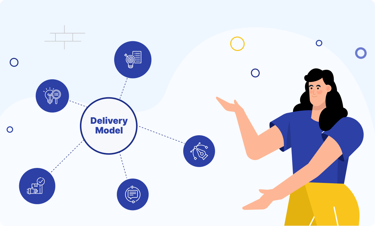
A simple delivery model that scales
1. Discover
- Interview three users per role
- Walk the current workflow and time each step
- Capture system handoffs and data pain points
- Walk the current workflow and time each step
- Capture system handoffs and data pain points
2. Define
- Prioritize one or two jobs to be done per role
- Write success criteria as measurable statements
- Create sketches that map state changes, not just screens
- Write success criteria as measurable statements
- Create sketches that map state changes, not just screens
3. Design
- Prototype to the level needed for honest feedback
- Validate with five users per role where possible
- Capture content, states, empty cases, and errors
- Validate with five users per role where possible
- Capture content, states, empty cases, and errors
4. Deliver
- Ship in narrow slices that complete a real job
- Instrument from day one
- Document what changed and why inside the product
- Instrument from day one
- Document what changed and why inside the product
5. Digest
- Review metrics and qualitative feedback
- Decide to iterate, promote, or retire
- Share what you learned with sales and success
This cadence builds momentum without overwhelming engineering or customers. It also teaches the organization that UX is a system, not a sprint.
- Decide to iterate, promote, or retire
- Share what you learned with sales and success
This cadence builds momentum without overwhelming engineering or customers. It also teaches the organization that UX is a system, not a sprint.
Practical case snapshots
The names are generic on purpose. The patterns are what matter.
Snapshot 1: Freight planning
A shipping planner needed to reprice loads across lanes every morning. The legacy screen required eight clicks per load. We introduced saved views, bulk actions with simulation, and keyboard shortcuts. Result: plan time dropped by half. Finance gained a clear log of price changes with reasons.
Snapshot 2: Compliance reviews
A healthcare vendor faced stalled security audits due to unclear data flows. We added data lineage views, access reports by role, and a downloadable evidence packet. Sales shortened proof cycles. Security reduced back-and-forth email.
Snapshot 3: Channel sales
Partners struggled to register deals and track status. We redesigned the intake with progressive disclosure, added SLA timers, and a feed of review comments. Deal cycle time improved. Support tickets fell as partners could self-serve status.
Common traps and how to avoid them
Stuffing the homepage
Home is not a dashboard for every metric. Show the top three tasks the user came to do and a short list of recent work.
Overusing modals
Use full pages for complex forms. Keep modals for quick edits that do not change context.
Hiding system states
If processing takes more than a second or two, show a state, a queue, and a place to check back. Quiet progress prevents duplicate submissions.
Designing for the demo
Demos love charts and gradients. Daily users love speed and forgiveness. Choose daily users.
Underestimating copy
Words carry the product. Write short labels, plain messages, and specific help. Maintain a vocabulary list so teams stay consistent.
Team shape and governance
A strong B2B UX program is cross-functional by default.
- Design covers interaction, visual systems, and content
- Product frames jobs to be done and measurable outcomes
- Engineering enforces performance budgets and component quality
- Data instruments events and maintains source of truth
- Security and Compliance review flows and logs early
- Customer Success feeds field insight back into the backlog
Set decision rules. Many teams use a simple ladder. The smallest group that owns the risk makes the call. Escalate only when impact crosses team boundaries.
Measuring value without drama
Tie the work to three buckets and report quarterly.
1. Revenue impact
Win rate, average deal cycle length, expansion in accounts with the new experience2.
2. Cost impact
Tickets per 100 active users, average handle time, training time for new roles
3. Risk reduction
SLA violations, audit findings resolved, security incidents related to UI flows
Use sparklines and trend lines. Keep the chart colors and axes the same every quarter so executives can read at a glance.
Conclusion
Enterprise UX is less about bright moments and more about dependable clarity. It respects roles, explains decisions, and moves work forward without surprises. It is as much a cultural habit as it is a design practice. When teams adopt that habit, sales conversations get easier, users stick around longer, and the product pays for itself in ways finance can verify.
If you choose only three moves to start, choose these:
1. Map two critical workflows per role and time them end-to-end
2. Install role-aware navigation with saved views and rich search
3. Ship one improvement per month that removes a step, adds a guardrail, or reveals a hidden state
Do that for two quarters, and your adoption, retention, and support charts will start telling the story for you.

Written by / Author
Manasi Maheshwari
Found this useful? Share With
Top blogs
Most Read Blogs
Wits Innovation Lab is where creativity and innovation flourish. We provide the tools you need to come up with innovative solutions for today's businesses, big or small.
© 2026 Wits Innovation Lab, All rights reserved
Crafted in-house by WIL’s talented minds